Swan's Identity Refresh
Context
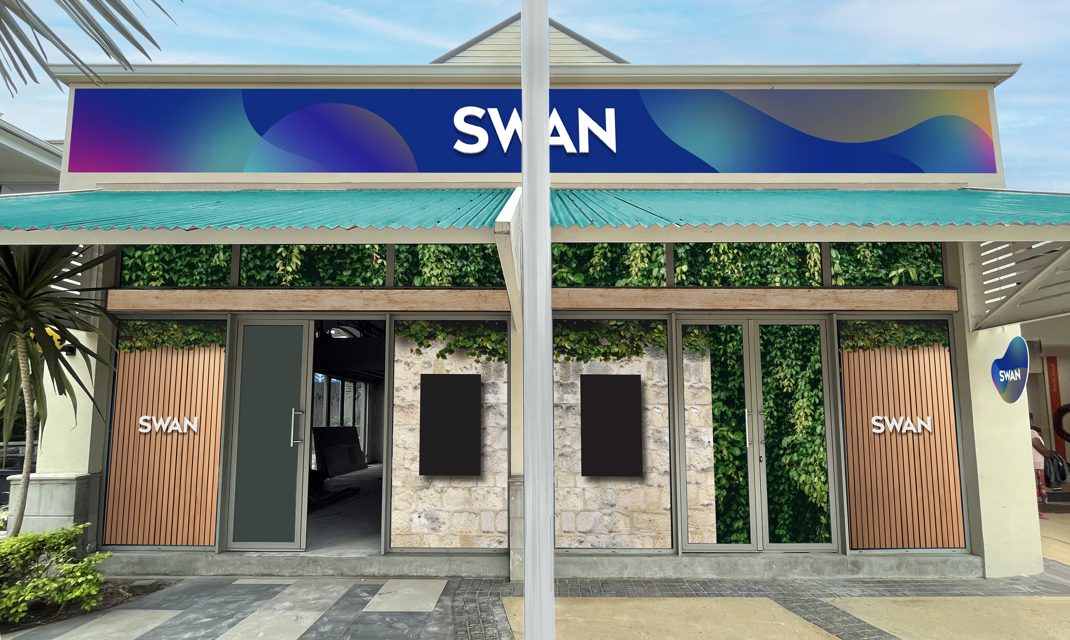
Bridging the gap between premium and accessible, SWAN, a leading insurance company, has long been seen as out of reach for many. The company decided to operate a switch.
Client

Year
2022
Service
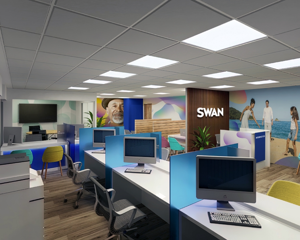
Branding & Design,
Space Design
Sector
Financial
Challenge
How to maintain a premium image while attracting more customers?
Solution
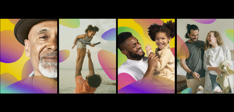
Swan embarked on a brand refresh with this challenge in mind. By removing perception barriers and adopting a visual language that resonates with everyone, we embraced and celebrated human flaws and imperfections. This approach opened the doors to the new Swan, creating an environment of belonging and acceptance.
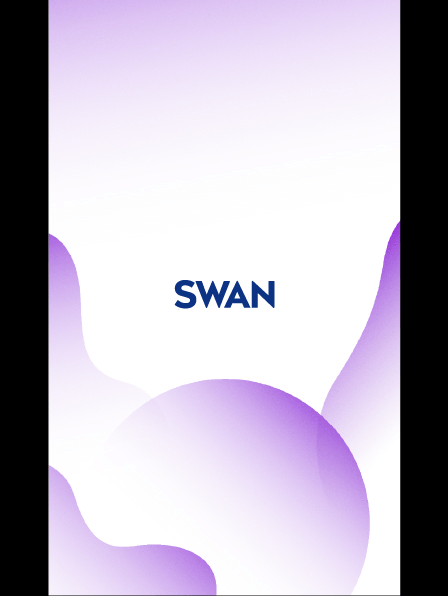
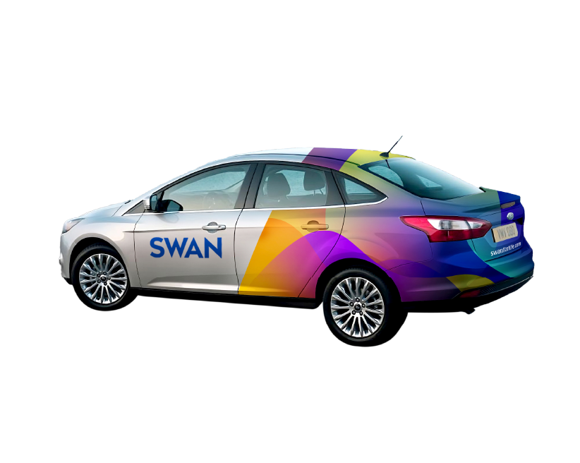
- 01The updated look features brighter colours, organic shapes, and genuine emotions through authentic photography.
- 02 The refreshed image successfully attracted a wider audience.

Explore more
See next
Eski's Independence Day Campaign 2023


